
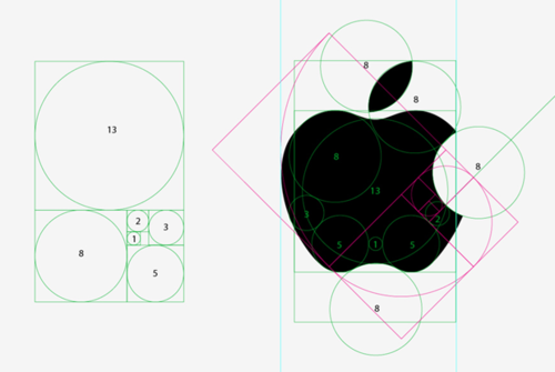
I love design, especially good design. And Apple has been a part of some great design in the past 30 years, other times not so much, I’m looking at you one button mice, and puck mice. But their logo has always been beautiful (although I am partial to the older multicolored one) But i was surprised just how well designed their logo is. It is a study in the golden rule, nay a graduate study in its use in design. This makes me want to layer the grid on the left onto some of my work to see just how close my eyeballed versions of design match to true perfection.
So as a form of homage to the beautiful bits of design Steve Jobs helped bring into the world, either by his singular vision, or the culture he created I’ll just leave this here.


 What’s old is new again")


 Coffee")


")


 Coffee")


 Work(s)")


