
Michael Deal Charts the Beatles. For a band that made a consistent hits. Its a well know fact that i have a serious weakness for Infographics and so call “infoporn” in general. I aspire to see things as these artists do.
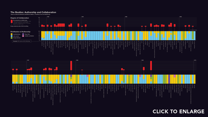
The above chart is an example of splicing the authorship of different Beatles with color coded bars. Seeing the authorship and the control over the musical direction over the course of their run visually gives a different sense as to how the band was creatively organized. In this case it’s not just about the band, which i like, but rather the different ways of conceptualizing the information that represents the band.
Eventually this larger infographic collaboration is going to be housed at http://www.chartingthebeatles.com/ so if you’re like me and dig yourself some infographicskeep it on your radar