One of the biggest problems I see people grapple with when trying to print photographs and graphics out on their color inkjet printers is that the finished product doesn’t always come out the way you expect it to. I spend a good deal of my time in my day job helping people fix their wonky documents and get the best possible result when trying to showcase their work in printed form. So Why not spread the love even more and distill the information into a small article for you. I have a couple of short tips and some terminology to help you out. However with a topic as huge and as technical as this its better broken up into usable chunks.
- DPI: Dots Per Inch, but basically think of this as how dense the information is layered into your document. The higher this number is the more detailed your photo can appear.
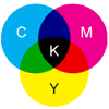
- CMYK: The primary colors of pigment, Cyan Magenta Yellow and Black.
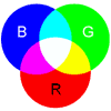
- RGB: Red green and blue, the three primary colors of light.
- Lossy: A file type that losses small amounts of data when you save to it through compression
- Lossless: A file type which retains all information when saving to it.
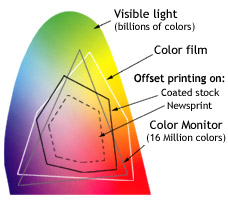
- Spectrum: The gamut of color in a given range. RGB and CMYK have different spectrums that they are capable of producing.


First thing you need to do is understand that after you took that awesome picture with your digital camera the camera captured all of the information in front of the lens and stored it as a file of RGB data. Meaning that it recorded the image it saw as percentages of red green and blue. Your printer will be printing these same pictures as CMYK. The RGB spectrum and the CMYK spectrum can represent most colors very well but there are certain areas where they don’t match up.
Certain colors you need to be aware of that have issues printing are deep blues, fleshtones, and yellows. That s not to say that they can’t be printed but that it is very possible that the output might differ from what you expect. These colors exist in parts of the spectrum of visible light where there is no direct CMYK translation for the color. This is one of the reasons printers have started coming out with additional inks such as green, orange, red and blue inks to try and expand the spectrum of printable color.
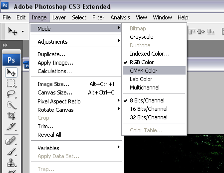
In photoshop there is an option the change the mode for the document from RGB to CMYK. Doing this will save you a lot of trouble in getting professional results.
Hopefully this little tip on the differences between the two spectrums helps you understand why not all of your pictures print the right way. Stay tuned as we release more tips in the coming days.


My apologies for being behind on your show (which is great I think), but with the advice you’re giving here (to convert to CMYK in advance) I really disagree. There is this story of color profiles…
I would rather advice to use RGB images with a color profile attached which covers a big spectrum (Like Adobe RGB), while useing a printer-profile made specifically for your printer.
The reason for this is that if you do a RGB-CMYK conversion with just any CMYK target profile (like the ones that come with photoshop), it might be that the target profile covers less colors than your printer can actually handle, which is a shame I’d say.
On top of that, a printer might be set to convert colors to it’s own profile (meaning it’s going to convert from CMYK profile A to CMYK profile B), which is another loss of precision/color.
On the other hand, if you use RGB in your applications, you usually have a broader range of colors in your picture than your printer can handle anyway. So printing from an RGB image doing the CMYK conversion driver-automated at print-time (to your printer-specific profile) will always get the most out of your printers possible color range.
Off course, your printer-driver has to support this. If it’s not the case, you can let Photoshop do the conversion at print-time, again useing a printer specific profile.
Hope this might be of help to you, I’ve always worked this way on my daily job on a repro-company. And my apologies if my English isn’t the best around, it’s not my native language.
Thanks for the comments Jaap,
I work as support for a university architecture program and we have had more success converting and attempting to work in CMYK during the creation of the document as opposed to color profiles. I am however open to suggestions and will gladly give it a shot. in the past we have gotten truer to screen output by working in CMYK, the wider gamut of rgb is nice but when converting to RGB at print time we have seen too many errors in converting the colors, noticeably a purple shift in blues and a mustard tone to skin tones.
Thanks for listening and the commentary! I’ll let you know if it works out better doing it your way!